|
: Self-Organizing Maps (a.k.a. Kohonen maps) :
: A self-organizing map (SOM) is a kind of neural network
that implements
: what's a k-means cluster algorithm. Essentially, the neual network
maps
: the *topology* of whatever input space it's exposed to. SOMs are
: amazing tools for analyzing high dimensional data sets with clustering.
: They've been applied to texture discrimination, feature detection/selection,
: genetic activity mapping, drug discovery, cloud classification, and
natural
: language (voice recognition, etc.), among others.
: SOMs were created by Kohonen,
who's laboratory has published
a free
: (under a GNU license) toolbox called the SOM
Toolbox for MatLab. For
: the purpose of this tutorial(?), I'll be employing that toolbox running
on
: an SGI Octane box named Ginger.
: Getting Started :
: Because self-organizing maps are rather esoteric and
can be very difficult
: to penetrate for high-dimensional and/or real-world data sets, I've
constructed
: a simple data set with three clusters of data points. The clusters
are uniformly
: distributed about the points (0,0,0), (3,3,3) and (9,0,0) with a maximum
: deviation from the center of 1 unit. We'll label them cluster1, cluster2,
: and cluster3 and give them 10, 15 and 20 points respectively.
: MatLab code :
: >> cluster1 = (2*(rand(10,3) - 0.5);
: >> cluster2 = (2*(rand(15,3) - 0.5);
: >> cluster3 = (2*(rand(20,3) - 0.5); cluster3(:,1) = cluster3(:,1)
+ 9;
: >> data = [cluster1; cluster2; cluster3]; %join cluster data
: >> for i=1:size(sD.data,1) %generate and store input vector
indices
: >> point_labels(i) = cellstr(num2str(i));
: >> end
: >> point_labels = point_labels';
: >> sD = som_data_struct(data,'name', 'Data','comp_names',...
: >> {'x','y','z'},'labels',point_labels); %generate som data
struct
: >> plot3(sD.data(:,1),sD.data(:,2),sD.data(:,3),'+r') %plot
data
: >> view(3), axis tight, view(-46,28)
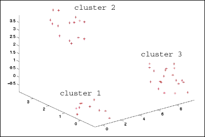
som_data3dplot.gif
: Initializing and Training the SOM :
: To initially train the SOM, I use mostly the default
settings. If you're
: interested in playing with the toolbox, I strongly suggest you read
through
: the help files, as they're excellent documentation. In this example,
: because the dimensionality of the input space (3) is larger than the
: dimensionality of the SOM (2, it's just a flat sheet), the map will
try to
: balance the competing errors in how well it maps the data points vs.
how
: well it maps the topology (imagine trying to bend a sheet of paper
to
: fill the interior of an empty cube).
: I'll let the som_make() function determine the best
size for the map
: (it does this by calculating the two largest eigenvalues of the data
set
: (sD) and uses those values as the dimensions). If the data range were
: particularly skewed in one dimension (those value were much larger
than
: the other values), we would need to normalize the data to prevent
that
: component from dominating the map topology.
: >> sM = som_make(sM, sD, 'comp_names', comps,
'labels', point_labels);
: The map trains itself pretty quickly because the smart
(and altruistic)
: guys at CIS programmed a batch training method. I could also have
used
: a sequential training method, but the batch seems better all-round.
: Because the data was from 3d space, I can visualize the map by simply
: plotting it in the same 3d space I plotted the clusters above.
: >> colormap(gray);
: >> som_grid(sMap,'Coord',sMap.codebook,...
: >> 'Markersize',2,'Linecolor','k','Surf',sMap.codebook(:,3))
: >> axis tight view(-46,28)
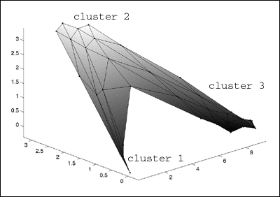
som_map3dplot.gif
: It's a little hard to see with this graphic, but the
map distributes nodes to
: clusters proportionate to the percentage of the data space which is
contained
: within the cluster Ð i.e. cluster 1, which has the fewest data points
receives
: the fewest number of map nodes.
: Analysis and Visualization :
: Now the real power of SOMs comes into play.
: With our toy data set, it's easy to see the clustering without any
fancy tools,
: imagine trying to visualize the clustering of a 4-dimensional data
set, or a
: 77-dimensional data set! (I've done that, it's hard) Regardless, this
is where
: the big guns come out to play.
: The basic analysis tool available is the so-called U-matrix.
I've plotted it
: below, along with a component map for each dimension of our data set.
: >> colormap(gray)
: >> som_show(sMap,'umat','all','comp',[1:size(sD.data,2)],'norm','d');
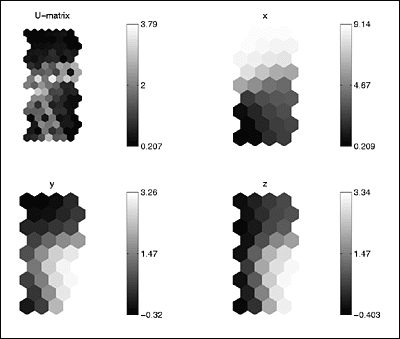
som_uMatrix.gif
: Understanding the U-matrix and Component Maps
:
: The SOM Toolbox graphics are truly very informative.
Each of the above
: plot displays the Euclidean distance between neighboring map nodes,
where
: dark colors indicate smaller distances (clustering), while lighter
colors indicate
: empty space. You can already see that there are three dark spots on
the
: map corresponding to our three clusters.
: Additionally, we can begin to pick out more information
about the clusters.
: The x-map's dark area indicates that those nodes are pretty close
to each
: other, i.e. there's a distinct cluster in the x-dimension (cluster
3). It also
: indicates that the opposite side of the map (light area) is about
9 units away
: (cluster 3), while the average node is 4.5 units away from other nodes.
: 4.5 units is roughly about how far cluster 1 is from cluster 2, and
how far cluster
: 2 is from cluster 3 - but we don't know that yet! The y- and z-maps
have two
: clusters (dark spots) both of which are about 3.3 units away from
the other
: side of the map.
: We can concretely say so far that there are two clusters
evident in the y- and
: z-dimensions. Definitely at least one well-defined cluster in the
x-dimension
: as well, but further analysis will reveal how this all adds up.
: More Self-Organizing Maps! (it
gets better)
|
|